

Feeling tired, strung out? Exercise is always a good remedy to revive your spirits. Illustration Friday inspired me to this card, by asking for submissions to the word "strings". Strings...strung...strung out - there you go!
I created the illustration for the German magazine LISA. I worked in Corel Painter, using a thick and thin ink pen, coloring areas with the fill tool, then adding a chalk-like brush on rough paper for texture, and airbrush for the cheeks.
Happy Weekend!
Showing posts with label Corel Painter. Show all posts
Showing posts with label Corel Painter. Show all posts
Happy Weekend Inspiration Card 14

Happy Weekend Inspiration Card 12
 "A woman can never be too packed with shopping bags!". Laugh. Well that's kind of absurd, and not very deep. But hey it fit's with today's Illustration Friday theme "packed"! For all fashionistas out there, the stylish fashion blog www.almostpacked.com also inspired me to post this inspiration card for this week's Illustration Friday theme.
I created this illustration for German magazine LISA, to an article that was wondering if shopping is in a woman's genes. How superficial. Of ourse it's not. Right?
Laugh. Have a great, happy weekend everyone!
Happy Weekend Inspiration Card 8
 Today, IllustrationFriday.com asks for submissions to the topic "memories". This led me to create this inspiration card.
Many psychologists, philosophers, buddhist leaders, and other successful people have written about "staying in the present". Lisa Smith-Batchen is a world class athlete and successful coach, whose athletic achievements have appeared on the covers of The NY Times, The LA Times, The Washington Post and Winning Magazine. She writes on her blog:
"You know what's interesting - I've been reading a lot of Buddist literature and books lately - it talks a lot about staying present, focused, here and now, positive etc. I notice when I run if I stay focused on the step I'm taking at the moment - not the last or the next one- and if I keep a positive attitude my energy level increases - now this isn't that surprising - but - I also notice - if I start to think about resentments I have or people I don't like in a negative way- I actually start to get weaker- and if I than re-focus on something positive- or reframe the resentment to understanding I immediately begin to feel stronger..."
Here's inspiration from the political arena: Today, Gov. Sarah Palin, who's serving her first term as Alaska's governor, made the nationwide news. Not only is she the first woman and the youngest person to hold the state's top political job, but now Sen. John McCain chose her as vice president! Go Gov. Palin!
Do you think she would be this successful if she often dwelled on her past? No way! So let's not dwell on the past, but focus on the now, and we'll have a future to look forward to.
This blog post is also dedicated to a friend of mine who still is being bothered by her past (and a very obnoxious, psycho boyfriend who can't let go and keeps bothering her). Girl, try to focus on the present. You left him, be glad! Try to ignore his efforts to still make you feel bad - focus on the now, on what you can and want to do for yourself, and work on your future.
Oil Self-Portrait in Corel Painter
Corel Painter offers so many brushes, it's near endless. I've decided to try a new field: oil paints. Here are step-by-step visuals of a self-portrait I created. I don't do self-portraits commercially, there are artists specialized in that. But it was an interesting experiment, to familiarize myself with the oil paints in Corel Painter!
I used only 3 brushes: wet brush, dry brush, and grainy blender. If you hold the pen down while using wet or dry brush, you can use them for blending too.
Step 1:
Using a photo as reference (try quick clone, you can blend it in and out), I lay down the basics.
Step 2:
In this case, I decided to change the colors, and I worked out the color areas some more. 
Step 3:
Starting to add a backround with a large brush.
Step 4:
I made the background more loose, making sure I keep large hand movements. This gives the image more movement and makes it more interesting. I also added more details: the eye had much more subtlety than the rest of the image. I therefore decided to add some fine brush strokes of similar quality on other areas of the painting, to make it more harmonious and interesting. I also adjusted the color areas in the neck and face, adding more rose-pink tones. This not only picked up the background color (which would be a natural light-reflection, and making the overall image more harmonious), but it gave the skin a warmer, softer color.
Step 5:
Usually I use Photoshop to adjust colors. It has a wider and more professional choice of adjustment tools. In this case, I tried using a tool from painter to make the colors more vibrant. Effect - equalize gave me a stronger saturation, so I think I'm happy with this result. This would be my final painting.
new illustration technique

Here's a new technique I developed for a customer in Sweden, with a classy hat and purse business for the woman with style. Check it out, done all-digital, but it looks like watercolor on paper with ink! Or do you see the difference? Tips and feedback welcome :-)
back from my vacations

Hello! I'm sorry I haven't posted in a while – I was on vacations! And before that it was hectic like crazy :-) Fitting my current mood and situation, here's a recent illustration I did for the German magazine LISA. It visualized a known problem we all have after vacations – what will we do with all our digital photos?? 1500 in my case (and I was gone for just 3 weeks!?!)
Hope you like the illustration,
Astrid
PotatoMammaDesign.com
gelaskins rock!
Okay this is not a hidden advertisement, but I truly love gelaskins - illustrated covers for ipods and laptops. And I'd love even more if one day I might get to illustrate for gelaskins. One of my dreams on my list...! These are a couple of suggestions that I submitted to gelaskins for consideration. No new artworks, I just used existing illustrations at this point. So far, truly great artists have been published on gelaskins, quite intimidating almost. Wish me luck, and good luck to you too, if you like to submit samples too. 


illustration friday "signs"

Recently, I've started to do illustrations and graphic design for the wedding market. Looks like there is a demand out there for custom tailored illustrations by artists who are published in magazines (you artists out there should try it out =)). This image here is in a style that I've never done before: the couple asked me to make them recognizable. I strictly don't do portraits, and don't advertise caricaturing (my deepest respect to all the portrait artists out there, I think this is so HARD!). Somehow I managed to make them kind of look like them, and the clients were happy (I'm not posting their photos for privacy reasons). The customers gave me a clear briefing and their photos, and put this image on the front of their wedding invitation card. They were not the pretty in pink wedding type, and asked to be portrayed on a tandem, travelling through Tuscany with their cat, following a sign that says "20 km to the registry office".
I'm posting it to the illustrationfriday.com theme "signs" because, well, it has a sign ;-) Hope you like it, even though it's different from what I usually do =)
Greetings! Astrid
illustration friday "citrus"

Something enTIRELly different for once! I created this illustration specifically for the IF topic "citrus", so it's not commercial, but just crazy. Seeing the word "citrus", I instantly got an image in my head of a woman biting into a lemon. I started playing around in Painter, then Photoshop, and look what happened. You tell me!
illustration friday "neighbor"

Hi everyone! Okay this post is a little far fetched to the topic "neighbor", but I thought I post it anyways. The women are neighbors on the beach, and, in the case of the left one, very critical ones at that.
The drawings are done in a new style! I combined vector with Corel Painter drawing additions (fabric detail and swirls in the hair), plus airbrush-like shading. The 2 illustrations are part of a series of 6 drawings done for a swimwear special in the magazine Femina, Switzerland. I kind of enjoy this new style, more easy-going and friendly than just vectors - what do you think?
Astrid
PotatoMammaDesign.com
my current favorite

This illustration was one of the suggestions for a manufactuer of gift products for the teen and young twen-market. They were looking for fashion-inspired, feminine imagery to print on articles like stationery, diaries etc. The artwork has not been published yet.
Astrid
-PotatoMammaDesign.com
illustration friday "crash"

Here's a little fun idea I did for illustrationfriday.com. Shall we call it the sweet revenge of all birds? (Click image to see larger). Greetings to you all!
Astrid
-PotatoMammaDesign.com
illustration friday "peace" #2

And another illustration that kind of fits the theme "peace". Lack thereof it is, in this case, or calm before the storm! Anyone know a good way out of the situation for the poor fellow? ;-) This was my holiday card I sent out to customers and friends this year. Hope you like it! (click to enlarge)
Greetings,
Astrid
illustration friday "peace"
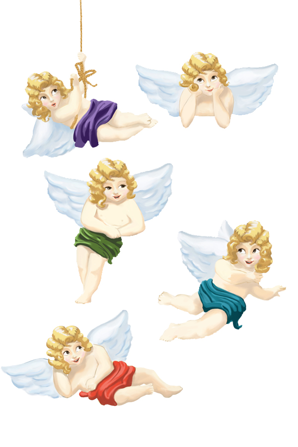
Happy Holidays everyone! This post is a little belated, sorry, got caught up in work =) I create these angels for the German magazine "Laura", to add a festive touch to their end of year editions. I tried a totally new style here, done in the program "Painter", with oil pastels. Isn't that program fun? (Click to enlarge)
Holiday Greetings to you all,
Astrid
illustration friday "might"

Might? This creative topic from illustrationfriday.com left quite open, which illustration one might post... ;-) I went for "I might buy this, or that, or that...." This illustration was done for the Swiss consumer magazine MIGROSMAGAZIN, to an article about going shopping for the new baby.
illustration friday "clear"
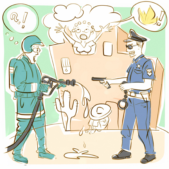
This is my contribution to the Illustrationfriday.com topic "clear". Background to the picture: it was an editorial illustration to a brief text on something crazy that happened. Apparently a true story, in Mexico, once the local policemen were not "clear" about the current situation: they mistook the firemen that were extinguishing a fire for burglars, and they arrested them! Guess they could have used a clearer job description? Or brighter policemen ;-) Hope you like the illustration =)
illustration friday "smoke"
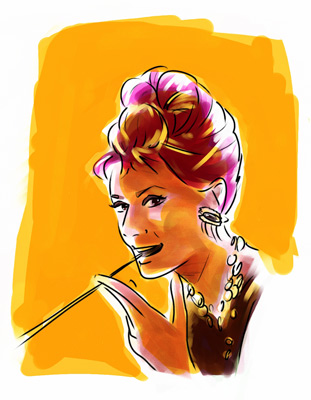
This was just a quick sketch and testing out of the programme "Painter". I love this program, the possibilities are endless! Don't know if you still recognize the person, but the image inspiration was a shot of Audrey Hepburn in Breakfast at Tiffany's. Hope you like it!
Greetings, Astrid
illustration friday "phobia"
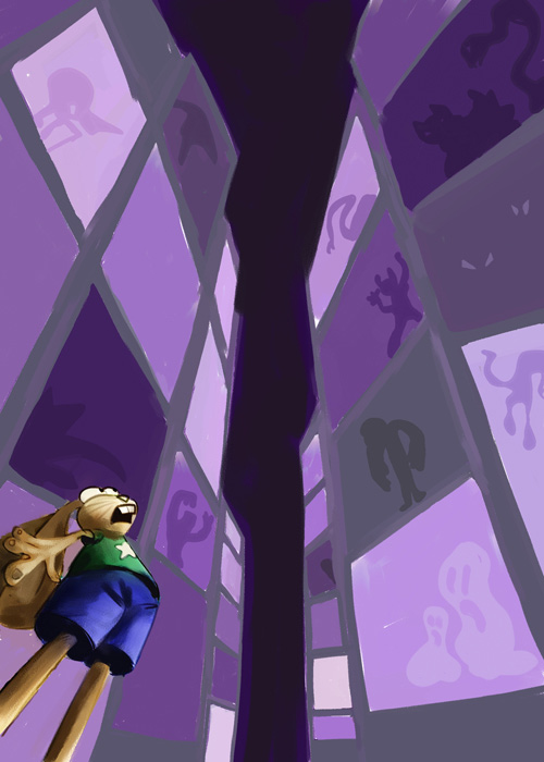
What a fun topic! My contribution of this Friday's creative challenge of illustrationfriday.com.
illustration friday "change"
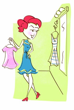
This illustration was created for a Swiss woman magazine. Even though I didn't specifically create it for IllustrationFriday.com, I think it doesn't fit too badly. What do you think?
illustration "clean"
 www.illustrationfriday.com suggested the topic "clean" for an illustration, so here is my contribution! This lady in the bathtub is not only clean but pulled a living mini mermaid out of the bathtub! Nothing's impossible in illustration, right? ;-)
Subscribe to:
Posts (Atom)


 Posts
Posts


